Arbeidsplassen
Service for the Norwegian Labour and Welfare Administration (NAV).
Manufacturer of high-end chains established in Norway in 1939, facing Industry 4.0.
The Nøsted Group was founded in Mandal, the southernmost municipality of Norway, as a manufacturer of high-end chains under the brand-name Trygg. The company has acquired 8 companies since 2004 (The two most important ones: Igland, producing tractor tools and forestry equipment. And Fram, producer of trawl chains and chains for securing aquaculture facilities and offshore industry). Together they have evolved and expanded into a major player with a global customer base.
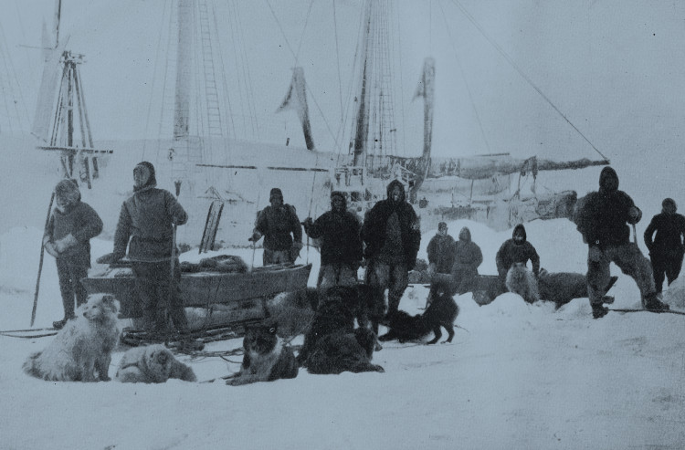
It is no coincidence that Kjættingfabrikken AS manufactured chains and other components under the brand name FRAM. When Fridtjof Nansen needed a chains for the polar expedition (with the ship Fram), Kjættingfabrikken was the supplier.
The group was large and the image fragmented, it needed to re-establish the true essence of the brand. Volum2 was hired to help lay the strategic foundation and brought Flammier onboard to lead the design process with them.
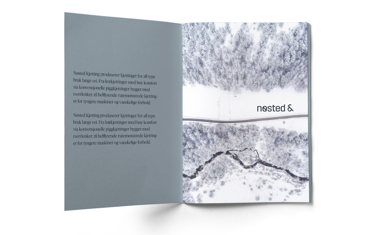
The “link” is the brand’s DNA. The Nøsted & identity is created with the future of global industry (industry 4.0) in mind. At the same time, the company’s history is based on century-long tradition and craftmanship. The Nøsted & world is all about connections ; connecting the competance with new technology, old challenges with new methods and new ambitions with unknown possibilities. Connecting these opposites also gives us a sence of duality. Snowy roads vs melted steel, tradition vs future, craftmaship through generations vs innovation, and so on.

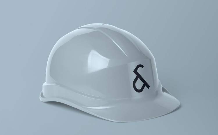

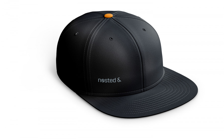
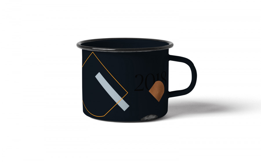
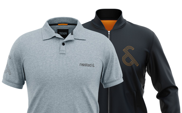
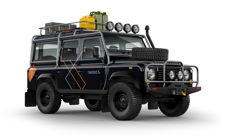
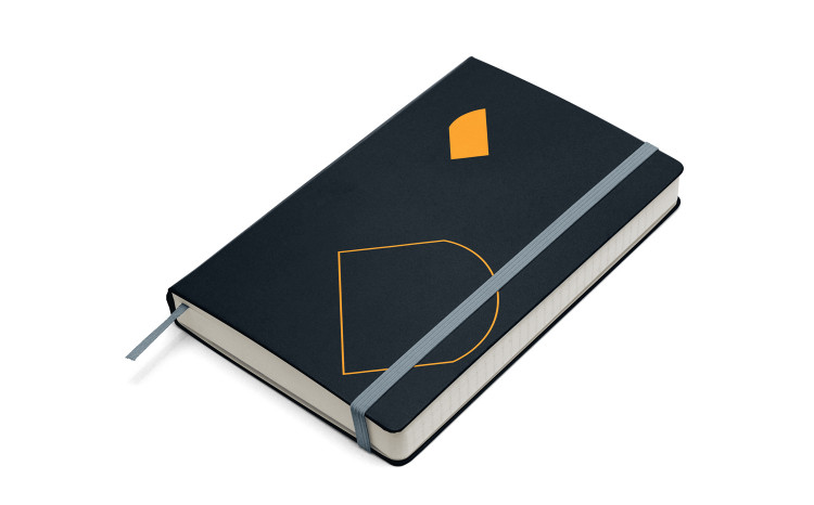
Outline versions of the ampersand and a system of supporting graphics was developed for decorative purposes, to give the identity life and illustrative tools that refer to the brand.
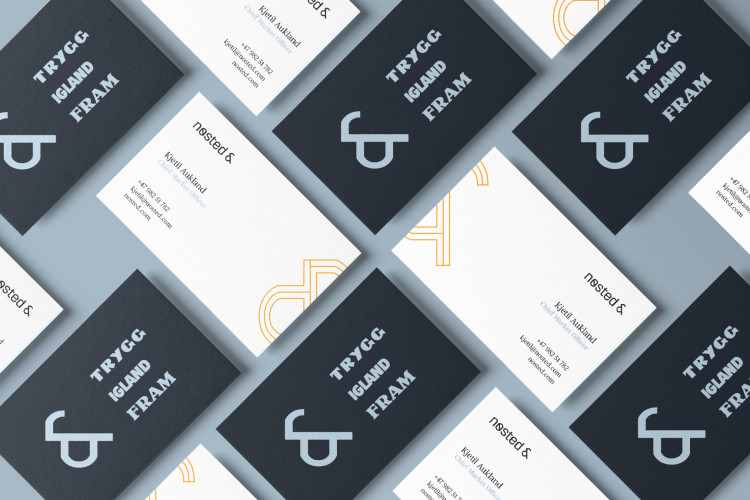
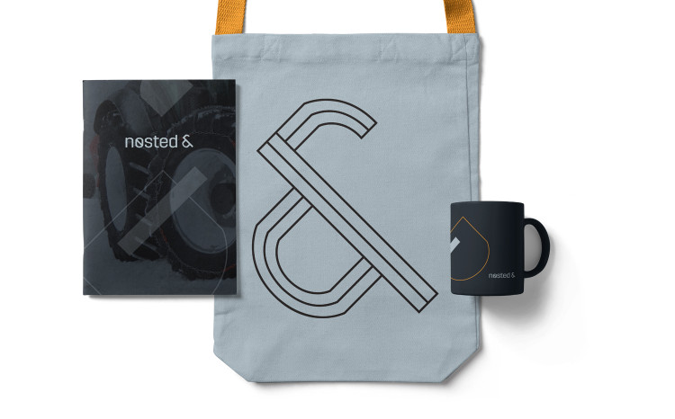
The colour palette has three primary colours that represent Nøsted &s activity, materials, production processes, etc. The primary palette consists of a black with subtle blue tones, a lighter gray also with blue tones. These colours refer to the industry, materials and icy environments some of the products are used in. The third colour is a warm orange referring to the energy from the production processes and warmer environments in general. This colour can be replaced by a copper foil where this is possible and purposeful. Tactility and texture is an essential part of the identity.
The Publico typeface is chosen to complement the mechanical and industrial aspects of the logo. It brings more elegance and rafinement to the mix, it’s editorial references communicate seriousness and value. This contrast between the typography and logo expressions supports the idea of duality described above.
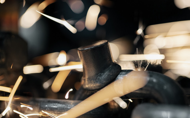
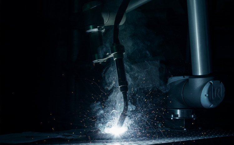
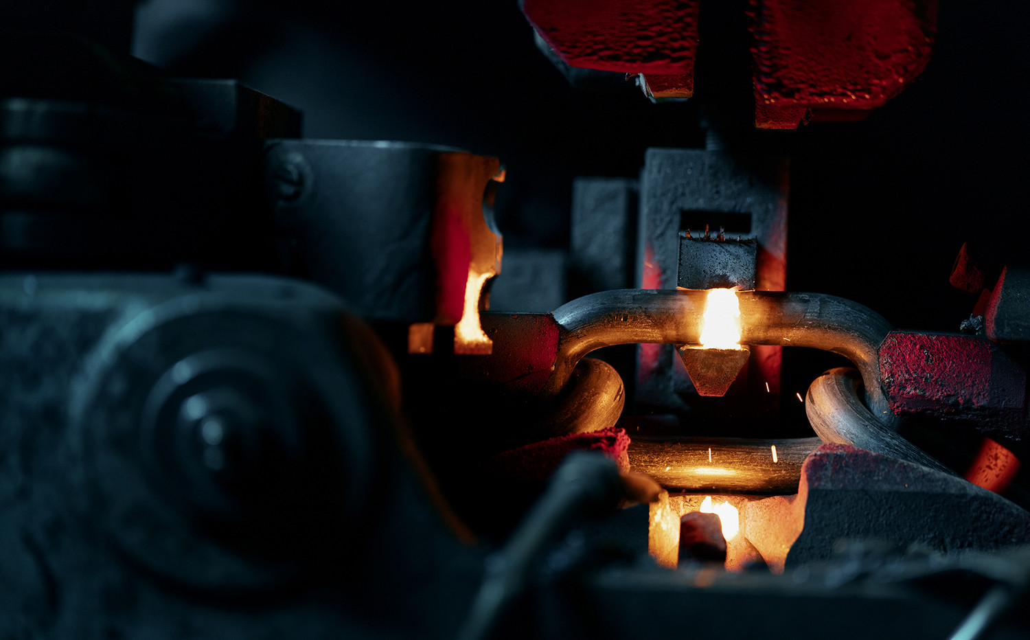
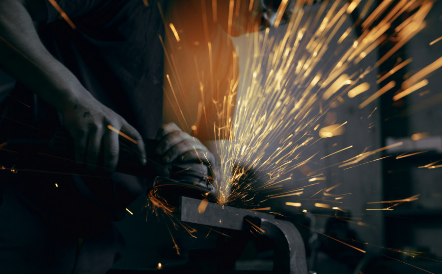
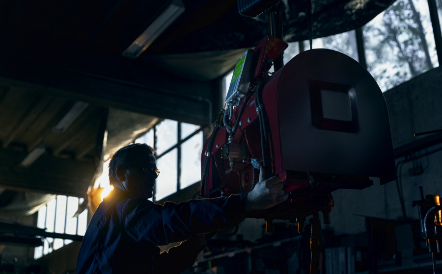
The production process offer exciting motifs with extreme contrast in colour and temperature, advanced robotics and tough manual labour. The motifs are litterarly taking us into the heat of the action and heart of the production.
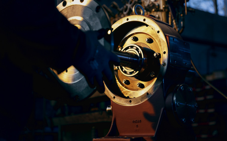
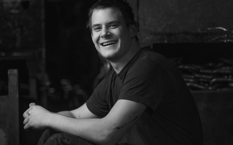
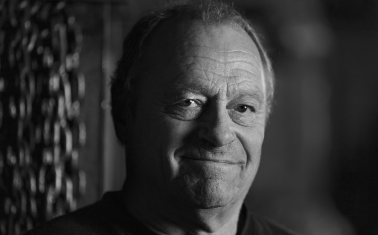
The people behind the products. To balance the dramatic (yet always controlled) environment full of contrast, portraits are in black and white. As work roles and environments will vary, this way of showing the people behind the products communicates unity and pride in working for Nøsted
Photos and video are taken for Nøsted & by Sune Eriksen.
A few expamples of elemtens that were produced for the launch of the new identity in 2018 (and some not yet put into life).